Oh, look at me in a spirited mood! And do you know why I am so spirited? Because I get to share some examples and tips from some of my favorite entrepreneurs on how they upped their video background games.
Perhaps you’ve noticed in my recent musings that I’m a bit obsessed with curating a great video background. It’s not that I’m an interior designer (although I wouldn’t mind it if I was!) but rather that I see the golden opportunity currently provided to us to level up our first (second, third, fourth,…) impressions.
Carpe Diem!
Backgrounds provide us with intention; a chance to have some semblance of control with how we show up. It’s a billboard of sorts and can be used to relay our intended messages. So I thought a little “inspo” might be in order.
Check out these fabulous women and see what they’ve done to leverage their video background to their nonverbal advantage.
Example 1: Tammy Barlette

Just by looking at Tammy and her background, you have a strong sense of who she is and what she does. My first impression words for Tammy’s look are cool lady, military, and pilot. I love her branding and the strong message it sends. Tammy is telling a story with her background. Plus the helmet is awesome and is a great conversation piece. And her clothing has that professional but approachable vibe.
Yes, Tammy is a retired Lieutenant Colonel and fighter pilot with over 20 years of active duty service to our nation, who now owns a speaking business featuring female veterans. How bada** is that?!
Check out her website at www.AthenasVoiceUSA.com.
Example 2: Sophie Zadeh


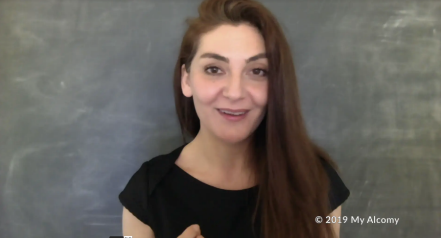
The second picture uses a chalkboard backdrop that she made for when she records an online course or video.
Sophie graciously shared her thrifty hack on how to create this look:
“I bought a piece of fabric and painted it using chalkboard paint that I made (acrylic paint mixed with powdered grout). I actually bought two pieces of fabric and painted different colors on four sides, so I have black, yellow, green, and white to choose from. I kept them on the cardboard rolls (they were the end of a roll) and roll them down when I need them. I put 2 hooks in my wall and a bamboo cane running through the roll, held up on the hooks.”
Check out her website at https://myalcomy.com/
Example 3: Kate Moody

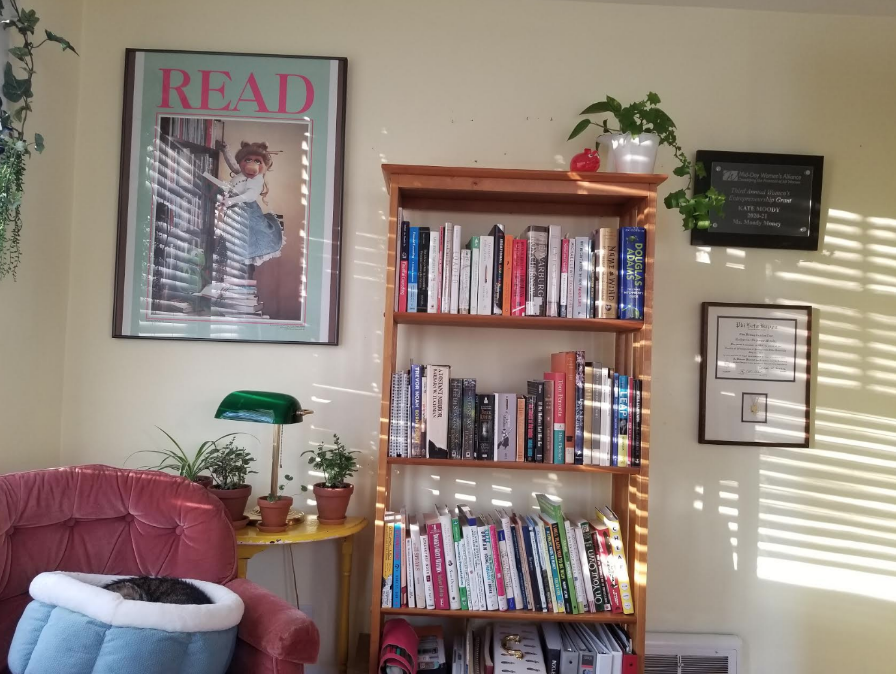
One look at Kate’s background probably has you thinking she is a librarian. Nope, but she used to be! Kate is a financial feminist and shares her wizardry with the online world which absolutely taps into her librarian skillset. I mean, who doesn’t want a personal finance coach who is organized, detailed, and loves to research and strategize?! And did I mention she has a killer sense of humor to boot?
Kate curated this look (on a shoestring budget, of course!) by switching out bookshelves from her home, paring down the pictures in her background to just one (Miss Piggy for the win!) and two awards. She completed the look by adding the banker’s light and adorable piggy bank on the top of the bookshelf. The sunlight and sleeping cat are both bonuses to this well-curated look.

And here is a picture of Kate. Note how her appearance matches her aesthetic.
Check out Kate’s website at https://www.msmoodymoney.com/
It’s time to get busy curating, Thundercat!
Your co-pilot (who’s decided we’ve known each other long enough to nickname you Thundercat),

